Research increasingly shows factors, such as wealth and geographic area, are causing disparities in infection rates for the coronavirus, according to Quartz News.
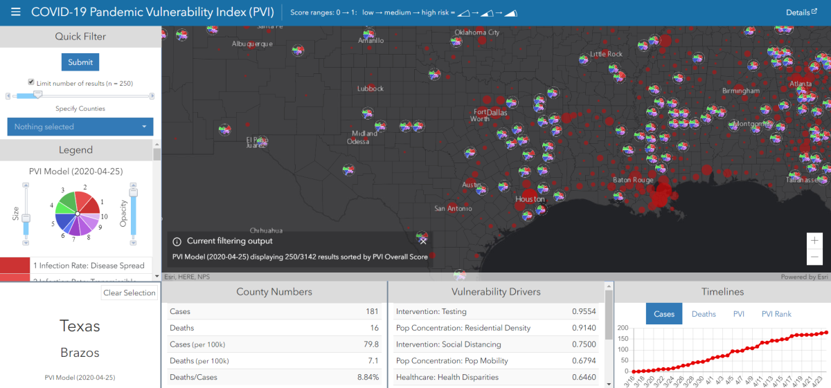
Researchers at Texas A&M and North Carolina State universities have developed the COVID-19 Pandemic Vulnerability Index (PVI) Dashboard to map the global spread of the virus. By highlighting certain infection hotspots, the dashboard helps address specific environmental factors within each geographical area that may explain higher or lower positive infection rates.
The PVI Dashboard was adapted in partnership by researchers at A&M and NC State through the Texas A&M Superfund Research Center from the existing ToxPi*GIS tool. Veterinary Integrative Biosciences (VIBS) professor and Director of the Texas A&M Superfund Research Center Ivan Rusyn, Ph.D., said the PVI Dashboard is intended to offer a visual model of communication that easily explains complex scientific data and information.
The dashboard displays radio pie charts on top of the mapped spread of COVID-19 to effectively communicate many different datasets at once, said Rusyn. These radio pie charts help to reduce the data down to four components: infection spread, population concentration density, prevention measures, and underlying health care factors, such as number of hospital beds and air pollution. Rusyn said including these components helps to project what future infection rates could look like and why.
“We’re trying to provide visual cues as to why certain things are changing, and why they’re changing on the local level rather than these model predictions that are usually state-wide or nation-wide,” Rusyn said. “The current models are very informative, but they’re not telling us much about why there was an increase or how long that increase is going to be sustained.”
Weihsueh Chiu, Ph.D., VIBS professor and a member of the research team, said this adapted dashboard was inspired by work he and Rusyn had been completing in partnership with the Environmental Defense Fund in Houston looking at environmental justice issues. Chiu said David Reif, Ph.D., a professor and researcher at NC State, had the idea to apply their tool to COVID-19.
“A lot of the vulnerabilities to COVID-19 are similar to those related to environmental justice,” Chiu said. “Socioeconomic status, minority status, low income, crowded housing, those types of things also appear to lead to higher risk of COVID-19 both in terms of more infections and more severe outcomes.”
Because most state governments rely on information from counties to implement top-down decisions, Rusyn said his team felt the dashboard needed to be focused at the county level. The dashboard divides states proportional to the population of each county, and the radio pie charts are relative to other counties in the country. The data for each component is collected locally and then weighed based on prior analysis.
Chiu said this county-level focus is aimed at helping state and local governments understand when vulnerability levels may be low enough to reopen the community. This method can help address the proper course of action if the virus’ spread is not slowed.
“By putting together a county-by-county tool, this could help both state and county health agencies see where they are more vulnerable to more severe or greater infections looking forward,” Chiu said. “They can also see what’s driving their vulnerability levels to better target what they’re going to do [in response] and how to prioritize resources.”
In addition to the importance of spreading accurate information regarding COVID-19, Rusyn said the overall value of this project is learning how to aggregate information on a national scale. The project also shows how to code that information to allow dynamic updates for time sensitive situations.
“We don’t have to only use this for COVID-19 or environmental vulnerabilities, as the original model was,” Rusyn said. “Now we have a platform that anyone with data on the county, state or national level can use. The platform itself and its ability to scale for environmental, public health, infectious disease, supply chain or any other types of projects, that’s the future of where this [dashboard] will be.”
In addition to Rusyn and Chiu, NC State researchers David Reif and Skylar Marvel, Ph.D., helped develop the tool.
New Pandemic Vulnerability Index dashboard maps global spread of COVID-19
April 26, 2020
0
Donate to The Battalion
$1915
$5000
Contributed
Our Goal
Your donation will support the student journalists of Texas A&M University - College Station. Your contribution will allow us to purchase equipment and cover our annual website hosting costs, in addition to paying freelance staffers for their work, travel costs for coverage and more!
More to Discover


